
A great visual identity is more than a logo. Learn the essential elements of strong brand design—and how they work together to build recognition and trust.
Introduction
A logo alone doesn’t make a brand—but a strong visual identity can make a brand unforgettable.
Too often, businesses treat visual identity as a quick design task instead of a strategic system. But without a cohesive and consistent visual identity, even the best messaging falls flat.
If you want your brand to be recognized, remembered, and respected, you need more than a logo—you need a visual identity that works across every platform and tells a consistent story.
At Rembrand, we design identity systems that are not only visually striking but also strategically aligned and built to scale.
In this article, we’ll break down what a strong visual identity includes, why each element matters, and how to make your brand instantly recognizable.
What Is a Visual Identity?
Your visual identity is the visual language that represents your brand.
It includes everything from your logo and color palette to typography, imagery, and layout systems. It’s how your brand shows up in the world—on your website, social media, packaging, pitch decks, and more.
A strong visual identity expresses your brand’s personality, values, and positioning without saying a word.
🧠 Takeaway: Your visual identity is how your brand speaks visually—and it needs to say something meaningful and consistent.
Why It Matters (Beyond Aesthetics)
Visual identity isn’t just about looking good. It’s about creating recognition, building trust, and standing out.
When done right, it:
- Makes your brand instantly recognizable
- Builds credibility and professionalism
- Creates emotional resonance
- Supports consistency across platforms
According to Lucidpress, consistent brand presentation can increase revenue by up to 23%.
🧠 Takeaway: Visual identity isn’t just art—it’s a business asset.
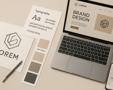
The Core Components of a Visual Identity
Here’s what goes into building a robust, recognizable visual identity:
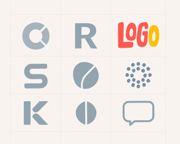
1. Logo
Your logo is the cornerstone of your visual identity. It should be:
- Scalable (works at small and large sizes)
- Flexible (works in full color, black & white, etc.)
- Aligned with your brand’s positioning and personality
Variants to consider: primary logo, stacked version, icon/favicon
2. Color Palette
Color communicates emotion. A strong palette includes:
- Primary colors: The main colors used across your brand
- Secondary colors: Accents or supporting shades
- Usage guidelines: When and how to use each color
Colors should reflect your brand’s personality and differentiate you from competitors.
3. Typography
Fonts affect readability and perception. A system usually includes:
- Headline font
- Body font
- Accent or display font (if needed)
- Hierarchy rules: sizes, spacing, and usage guidance
Consistency in typography builds familiarity and trust.
4. Imagery Style
Images tell your story. Your guidelines should include:
- Photography style (e.g., candid, editorial, high-contrast)
- Illustration direction (flat, detailed, abstract?)
- Iconography usage and style
Visual consistency helps reinforce your brand tone.
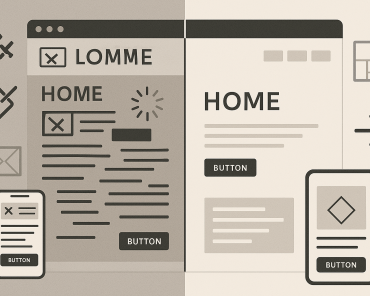
5. Design System & Layouts
Beyond individual assets, you need systems:
- Grid systems and spacing rules
- Button and UI element styles
- Layout templates for web, print, and social
These ensure your brand looks cohesive everywhere.
6. Usage Guidelines
A brand identity is only as strong as its implementation. Provide:
- Clear rules for logo use (and misuse)
- Do’s and don’ts
- Examples of real-world usage
🧠 Takeaway: Each element plays a role in making your brand cohesive, memorable, and scalable.
How to Make Your Visual Identity Strong and Scalable
It’s not enough to look good. Your identity should also work hard behind the scenes:
- Anchor it in strategy: Start with your brand positioning, values, and audience insights
- Design for flexibility: It must work across platforms, sizes, and use cases
- Create documentation: Style guides, UI kits, and asset libraries keep teams aligned
- Build for longevity: Avoid trends unless they truly align with your brand’s DNA
As designer Paul Rand said, “Design is the silent ambassador of your brand.”
🧠 Takeaway: A strong visual identity is one that grows with you—and makes you unmistakable at every touchpoint.
Conclusion
A strong visual identity is more than decoration. It’s a strategic asset that shapes perception, builds trust, and supports growth.
Every element—from your logo to your font choices—should work together to express your brand’s story with clarity and consistency.
Audit your current identity:
- Is it cohesive?
- Is it consistent across channels?
- Does it reflect your positioning and personality?
If the answer is “not quite,” it may be time to rethink and rebuild.
Because looks matter. But meaning matters more.