
Introduction
If you’ve ever looked at a billion-dollar company’s logo and thought, “Wait… that’s it?”—you’re not alone.
From the plain wordmark of Google to the chaotic charm of Comic Sans-style startups, some of the most impactful brands out there don’t follow conventional design rules. In fact, they often break them.
But here’s the thing: good design isn’t about being pretty. It’s about being effective.
And in branding, that means being memorable, distinct, and aligned with what your audience needs to feel.
In this post, we’re flipping the design script. We’ll explore why “ugly” logos often win—and what good design actually looks like when it’s doing its real job: building emotional resonance and clarity across every touchpoint.
1. What We Really Mean by “Ugly”
First, let’s define our terms.
When we say “ugly,” we’re talking about logos that:
- Don’t follow aesthetic trends
- Look overly simple or even amateurish
- Might make a designer wince—but still succeed wildly in the real world
Think:
- Google’s colorful, unstyled wordmark
- Supreme’s bold red box and Futura Bold
- Craigslist’s stubborn refusal to ever “modernize”
These logos aren’t “ugly” because they’re poorly designed. They’re “ugly” because they don’t fit the mold of what we expect “good design” to look like.
But they work. And that’s the point.
2. Good Design Is About Resonance, Not Beauty
A logo isn’t an art piece. It’s a tool for memory and recognition.
And like any tool, its value lies in how well it performs its job.
Good design is:
- Distinctive – You recognize it instantly
- Flexible – It works on a billboard and a browser tab
- Meaningful – It connects with the brand’s personality and audience
- Consistent – It plays well with the rest of the brand system
“Pretty” doesn’t guarantee any of that. In fact, overly polished logos can blend in. They follow trends. They risk looking like everyone else in five years—or worse, right now.
Ugly logos? They’re often weird enough to stick.
3. Execution Beats Aesthetics Every Time
Let’s get real: a beautiful logo that doesn’t scale, doesn’t read at small sizes, or doesn’t align with your audience’s expectations… is a fail.
Design isn’t just how something looks. It’s how it works.
You need a logo that:
- Works in one color
- Looks good in motion
- Balances on mobile screens and packaging alike
- Embeds meaning without trying too hard
The best logos aren’t trying to impress other designers. They’re trying to help a customer feel something—and remember you.
Example: Mailchimp’s chimp head sketch breaks every rule. But it’s perfect. It’s quirky, confident, and instantly recognizable. It works because it reflects the brand’s voice, not because it’s elegant.
4. What Good Design Really Means
So what is good design in branding?
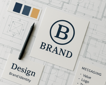
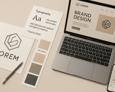
It’s not just the logo. It’s the system. The full visual language. The way everything hangs together and builds emotional clarity for your audience.
Good design:
- Communicates personality
- Removes friction
- Builds trust through consistency
- Adapts, evolves, and scales
- Creates an emotional fingerprint
Your logo is the front door. But good design is the whole experience—the way your brand walks, talks, and feels.
And when it comes to your logo? If it’s clear, distinctive, and emotionally aligned… it’s good design. Even if it’s ugly.
Conclusion: Be Memorable, Not Pretty
So next time you look at a logo and think, “That’s not very nice to look at…”—pause.
Ask instead: Does it work? Does it stick? Does it feel right for the brand?
Because at the end of the day, no one’s choosing your brand because the kerning is flawless. They’re choosing it because something about it clicked. It felt real. It felt like it was for them.
That’s good design.
And if that means your logo breaks a few aesthetic rules? Even better.
Call to Action
👉 Want a brand identity that resonates?
Let’s design a brand that works in the real world.