Learn how to design a brand identity system that scales across web, print, packaging, and social—without losing cohesion.
Introduction
Your brand identity shouldn’t fall apart the moment it moves from a website to a billboard or an Instagram Story.
A strong brand identity isn’t just beautiful—it’s adaptable, consistent, and instantly recognizable across every touchpoint.
At Rembrand, we design scalable brand systems that flex with the real world. Whether it’s digital, print, packaging, or motion, your identity should feel seamless and strategic.
In this article, we’ll walk through what makes a brand identity actually work everywhere—and how to build one that holds up in any format.
What Is a Brand Identity System?
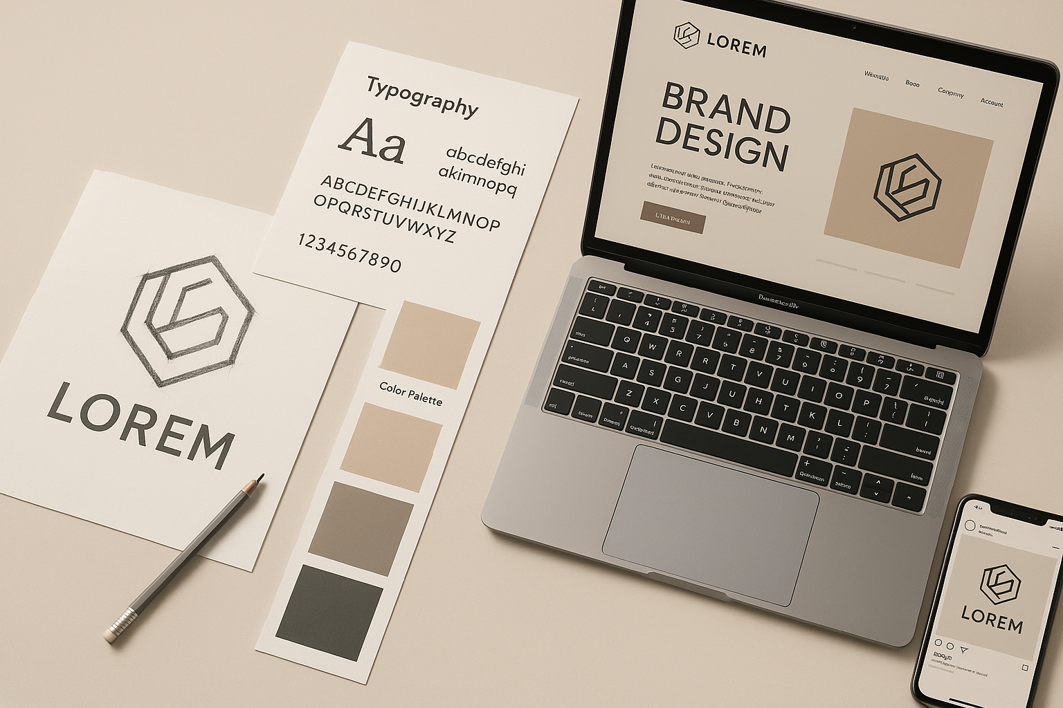
Your brand identity is more than a logo—it’s the full visual and verbal language that represents your brand.
A complete identity system includes:
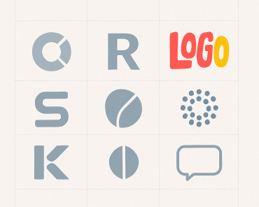
- Logo(s) and lockups
- Color palette
- Typography hierarchy
- Visual language (shapes, textures, patterns)
- Imagery and iconography
- Voice, tone, and messaging
A brand identity system means these elements are built with structure, logic, and room to grow.
🧠 Takeaway: A brand identity system isn’t just a file folder—it’s a toolkit built to scale.
The Problem with One-Off Designs
Too often, brands treat identity like a single-use project:
- A designer creates a logo
- A color palette is picked with no context
- Fonts are chosen based on trends
Then it all breaks the moment you try to build a website, design a deck, or launch a product.
Without a system, you get:
- Inconsistent brand expression
- Design drift across channels
- A brand that feels disjointed and forgettable
🧠 Takeaway: One-off design is short-term. Identity systems are built for long-term consistency and growth.
Elements of a Flexible Identity (With Examples)
Here are the components every flexible brand identity should include:
1. Logo System
- Primary logo
- Icon or mark
- Wordmark-only version
- Vertical/horizontal lockups
Use Case: Website header, social profile, packaging, app icon
2. Scalable Typography
- Clear hierarchy (H1, H2, body, CTA)
- Works on mobile, print, and large formats
- Readability in different environments
Use Case: Web UI, presentations, print ads
3. Responsive Color Palette
- Core brand colors with secondary accents
- Accessibility contrast tested
- Works in dark/light mode environments
Use Case: UI design, apparel, signage
4. Modular Visual Language
- Shapes, patterns, motion principles
- Supports storytelling without relying on logo
Use Case: Social media, product packaging, animations
5. Image Style & Iconography
- Guidelines for photography, illustration, and icon use
- Consistent tone and usage
Use Case: Slide decks, blog visuals, campaign assets
🧠 Takeaway: Identity systems allow creativity within consistency.
Tips for Building Visual Consistency Across Mediums
- Design in context: Don’t just design in Figma—test in real-world formats
- Create usage rules: Document spacing, logo placement, do’s and don’ts
- Plan for limitations: Small screens, black & white printing, accessibility
- Think in systems, not samples: Brand kits > one-off files
- Train your team: Adoption matters more than perfection
🧠 Takeaway: The best identities aren’t the most clever—they’re the most usable.
Common Mistakes to Avoid
- Designing without strategy or positioning
- Over-relying on a logo without a visual system
- Using trendy fonts or colors that age quickly
- Ignoring accessibility and scalability
- Not creating brand guidelines or templates
🧠 Takeaway: If your identity can’t evolve, it’ll hold your brand back.
Conclusion
A brand identity that works everywhere doesn’t just look good—it works hard.
It creates consistency, flexibility, and confidence across every channel you show up on.
At Rembrand, we build brand identity systems that scale—so your brand doesn’t just survive change, it thrives in it.
Whether you’re launching or growing, now is the time to future-proof your brand design.