Lit Bits, a dynamic platform offering bite-sized book summaries for readers, professionals, and lifelong learners seeking accessible and impactful knowledge.
our role
Objective
Develop a brand identity and logo that visually captures the essence of Lit Bits: knowledge, accessibility, and modernity. The design should appeal to a broad audience while emphasizing innovation, clarity, and the joy of learning in small, digestible pieces.
The Strategy
Approach
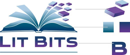
The Lit Bits logo features a striking open book design with cascading pages transforming into modular blocks, symbolizing the platform’s transition of complex knowledge into simplified, actionable insights. The balance between flowing elements (the open book) and structured ones (the blocks) mirrors the seamless integration of traditional learning values with modern, data-driven delivery.
The geometric blocks reflect the “bits” concept, emphasizing modularity and efficiency in learning.
The gradient color palette of deep blue transitioning to vibrant purple signifies trust, professionalism, and creativity.
The bold typography complements the logo with a contemporary and approachable feel, reinforcing Lit Bits’ commitment to innovation and accessibility.
The Impact
Results
The Lit Bits logo successfully communicates the brand’s mission to make knowledge accessible and engaging. The visually compelling design positions Lit Bits as a forward-thinking platform for learning, resonating with diverse audiences seeking quick and impactful content. The new identity enhances brand recognition and reinforces its unique value in the marketplace.